Students Guide to Printing- 47
-Few objective Questions and answers-
189) What is Layout and its primary objective in Printing ?
The primary objective of the Layout designing process in printing is to communicate/show the appearance of the print material clearly and effectively to the customer by way of single page format before commencing printing. Once the appearance of the page format is decided, then a base guide sheet called Layout would be prepared for the placement of the pre-print material in the intended position correctly for further processing and to make the pages appear sequentially in order after the printed sheets are compiled and trimmed to book form. The pre-print material is the composed matter and illustrations which forms each page.
189 a) What are the components of the Layout sheet?
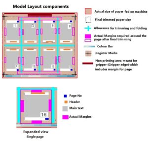
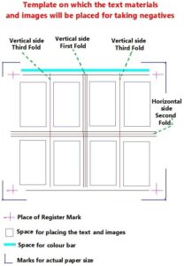
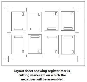
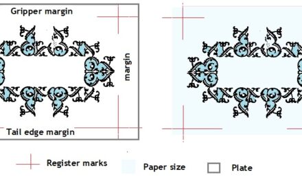
The base guide sheet called Layout show the positions of the text material, margins on all sides, places where header, page nos, colour guide, register marks etc would appear is meant for assembling the composed text material and the illustrations together before preparation of master plate for printing.
189 b) What is the Master Layout ?
Based on the above model layout, instruction sheet or master Layout called Master Layout of Master template would be prepared clearly indicating the positions where the composed matter would sit, places where the headings, page nos, images, colour bars and register mark etc would appear and also show the margins needed on all sides keeping in mind the trimming and folding area margin allowances.
Whenever a book containing several pages are to be printed, they will not be printed as individual sheets. The entire composed matter would be first laid out in page form which would then be assembled in such a manner that when a sheet is printed back to back with the laid out text material, folded and trimmed to the ultimate book or to the print format, all the pages printed, folded and trimmed would have correct sequence of pages i.e in readable sequence.
189 c) What is Page make up ?
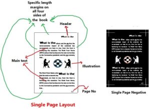
The entire text material composed are to be fixed in the proper place (well registered) along with the illustrations wherever necessary in each of the pages which will then be used to make negative or positive for assembling together on the Master Layout sheet in specific manner for the preparation of the final printing plate. Arranging the text material along with illustrations in each of the single page is called Page make up. Each page will be prepared containing the text and illustrations in their appropriate places along with the headers and page nos without entering into the specific white margins needed on all the sides of the pages after trimming.
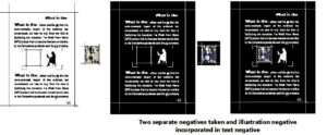
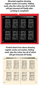
Sometimes the laid out pages will be prepared containing only the text material leaving space in them to accommodate the halftone and/or other illustrations. Negatives of both text material and illustration will be separately prepared and then both will be clubbed together. Once two negatives of the same page is made, the illustrations whose negatives are also available would be incorporated in the specific positions allotted in each pages by stripping process using cello tapes. See illustration below.
189 d) What is called Image areas ?
Every sheet will have some areas where the images and other texts will be printed. The image will be surrounded by white margins all around. The sheet where the images and texts are to be printed is termed the image area. The entire areas which will be blank and non-printable will be called non image areas.
189 e) What is known as Imposition ?
Once the matter composed by any means of convenience available is laid out into single pages, then either negatives or positives are made ready containing the text and images/illustrations, they would be assembled as per the maximum paper printable using the master template as guide. The master Layout would be prepared on Australone sheets or transparent film based material or on golden rod paper (a variety of thick tracing paper).
189 f) What are the key elements in Layout process in computer or other varieties of type setting ?
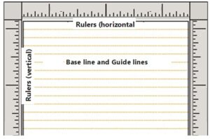
Few key elements in the Layout process are base line, center line and guide lines.
- Baseline is an imaginary line on which the text matter appear. The base line help you align the text matters.
- Guide lines called rulers help the layout artist to align the material for printing horizontally or vertically on a page.
They are called Layout guides in which the rulers help to determine the dimensions of the publication elements, such as the margins, text boxes, columns, and so on. Layout guides help you maintain the alignment of objects, such as pictures, text boxes, and tables.
189- g) What are layout guides?
Layout guides help the artist maintain the alignment of objects, such as pictures, text boxes, and tables. When enabled, the layout guides give you visible guidance to align objects on the page.
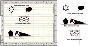
Shapes, Pictures, Text Boxes, Tables, Word Art, and Grouped objects can align using their edges or their mid lines. Tables can also align using their grid lines or alignment lines. Edge alignment or Center alignment or Base alignments are different means to align the irregular shaped design elements. Therefore they are aligned in both vertical or horizontal positions with center axis lines or base axis lines.
189- h) What is the Alignment Principles in Graphic Design ?
The primary objective of any page layout- whether it’s for a printed brochure or books or any other pamphlet is its readability and eye catching ability. Therefore both the text material and the images in them are to remain balanced. Therefore the layout artist or the designer format them in different ways every time a new job is undertaken.
There are three to four types of alignments available. Each one of them pertains to the printed books down to the printed products such as pamphlets, product cards, visiting cards and post cards or other such advertising material.
189- i) Justified
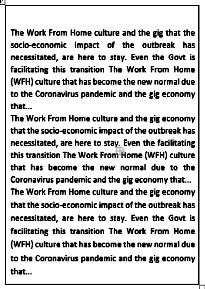
Generally the entire text material-main matter to read- remains justified in the printed books, newspapers, magazines and other regular publications. The running matter begins from a specific point on the left side margin and ends on a specific point on the right side margins. Similarly they begin from a specific point on top and end on specific point at the bottom margin. They are called ‘Alignment Justified’. Justified alignment helps to keep multiple columns of text looking neat and organized.
189- j) Left aligned
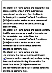
Text beginning from a specific point on the left side margin ends just before the specific end point on the right side margin. Few lines may touch the end point and few will end up before reaching the right end margin thus making the right side margin gap appear in Zig Zag manner.
189- k) Right aligned
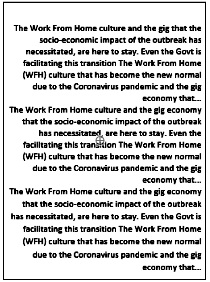
Flush right alignment of the print material is much less common compared to others and are adapted only in the advertising material/pamphlets/brochures or cards of different nature a unique or offbeat look and feel. They are not used on regular book work as the readability would be difficult.
189- l) Center aligned
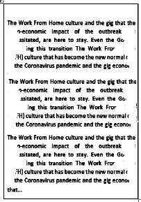
This is adapted mainly on product based ad materials, visiting cards, invitations of many types, greeting cards etc which may contain several sizes of fonts, type faces and illustrations and can also be adapted in books of poems or prose, quotes etc.




Recent Comments