Alphabet – T /3

11. Typography : Typography is the art and technique of arranging type matter to ensure that the printed matter appear elegant, pleasing to the eye and easily readable. This therefore involves proper font selection for the particular job. While selecting the type fonts, not only the type style will be taken care of, but also the size of fonts for each element like headings, sub headings, main text, page no, the spaces required between lines, space between fonts- etc are to be properly selected. It is not an easy task unless you are a good graphic designer or a typographer or a compositor to choose and arrange the type that is legible and attractive. Therefore such work will have to be left to the discretion of the typographers who are specialists in such work.
For example for the sake of making some layout design one can not use Georgia type face with Times Roman fonts even though both are fonts with serifs. But they will not match. Similarly a San serif fonts like Verdana can not be used with San serif font of Impact font. It can be combined with italic type faces. There are many such rules.
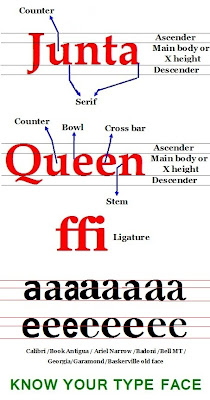
Take the case of contrast of the font colors. A thin font printed in lighter color can not read well. There is some concept like family of type faces and one will have to consider such aspects unless it is hand drawn or illustrated letters. If you see the different type faces of fonts, you can observe the placement of the cross bars and strokes almost uniform to suggest that common factor – may be aesthetic- has been kept in mind while designing them (See below the illustration where letter a and e has been shown). This is one beauty in Typography.
Remember every letter has several inbuilt features in them. Some of them include the following :
- Ascenders
- Descender
- Main body or X height
- Serif
- Counter
- Bowl
- Stem
- Terminal
- Ligature Cross bar
The entire type faces have been designed taking into account all the above aspects which have some common proportions with each other. Each letter has also been designed with proportional spaces for each letter. You can not expect the same space for all the letters like W and U and I. There are several fonts available for use. They include handwritten fonts, San serif fonts, Fonts with serif- both square and sharp pointed and Novelty fonts.
How will you match the main text with main heading and Sub heading? Is there any set formula or fixed rules or guide available for type setting ? The answer could be a simple ‘No’. But if you go through several of books and other print material, particularly book formats, you will find unwritten code being followed in selection of type sizes to improve readability and to enhance the appearance.
If the body text is something like ‘X’ then the heading will be something like X plus half of X, and the sub headings will be X+2. To make this clear let us assume that the main text is set in 10 point, then the heading will be 15 point and the sub heading will be 12 point size. This is only an observation based on many printed books and not a fixed rule. But it will definitely work well to enhance the appearance of the print material.
12. Tearing resistance: While the Tensile strength is meant to determine the point at which the paper will crack or burst, the Tear resistance is another important property for paper that is taken into account while manufacturing of bond papers, cover papers and wrapping papers.
Tearing resistance indicates the ability of the paper to withstand tearing force when it is subjected to. When a paper gets torn at the edges, how fast it can be torn in either directions will determine the tear resistance. The test will demonstrate whether the paper will get easily torn or strong enough to withstand the wear and tear during various stages of usage. If the paper gets easily torn (once the edge starts tearing) then it can be considered to be a weak paper. Therefore the paper is subjected to tear resistance test in both ways i.e Machine direction and Cross direction and average worked out to express the tear count in Mille Newton i.e mN.
The fiber in the paper determine the strength and therefore fibers floating in the machine direction will be more stronger, at the same time more suitable to use on jobs where creasing or scoring operations in addition to folding operations are involved. However for wrappers, covers and other such usages like packaging papers, the paper needs to be stronger in both ways. In order to ensure that the paper remains stronger in both ways, the pulp travel path wire is shaken in regular intervals to ensure that the fiber float direction is made both vertical and horizontal.
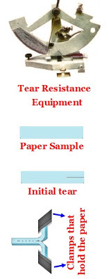
One of the most commonly used instrument to measure the tear test is the Elmendorf Tear Tester which measures the force perpendicular to the plane of the paper required to tear multiple plies through a specified distance after the tear has started. All the tests are carried out in specified conditions with specified size of samples. Four ply (Four sheets one under the other) test samples are clamped to the clamper provided on the machine and with the integral knife handle fitted on the same machine the initial cut is performed. Since the machine is pre-programmed, the extent to which the initial cut is to be made etc will be uniform. Then the pendulum will be released to perform the tearing. Then the readings of both the force required for initial cut and the tear with pendulum apparatus will be computed and result obtained.
13. Trim Marks: These marks are made to show where the cut has to be made to finish the book or job which has been printed to a particular Layout. They form part of the layout and are actually the end of the margin area. Such trim marks goes away with the trimmed portion. Some times the same marks are also used as Register marks to register the images.
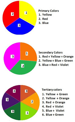
14. Tertiary Colors: In color theory the three basic colors Yellow, Cyan and Magenta form the secondary colors and Tertiary colours. When every two of the three colors sit one on top of the other they form the secondary colors and when two of the three secondary colors sit one on top of each other they form the tertiary colors.
15. Type setting: The process of translating the manuscripts into printable form either by mechanical process that is hand composing or through photo composing method is called Type setting process. The Type setting includes sufficient space for incorporating images if any in the composed matter. Type setting is an interesting art. This work involve combining both text and illustrations and laying it out on the page to make it ready for printing. The process of setting the manuscript material into type or into any form which can be used in printing also falls in this category of Type setting.
It will be interesting to know how the modern type setting process developed from the hand composing stage. In the past when the printing process came into being, the manuscripts used to be composed by hands using individual letters to form words. It was time consuming, but had its own style and speed depending on the skill of the compositor and Typesetting has a rich history in the art of the printing where the compositors in the past worked by hand and later by machines to produce printed material.
The next generation saw the emergence of hot metal type setters called Lino type, Inter type, and Mono Type machines through which the same hand composed matter could be machine composed to produce lines of types which were set to pages and used for printing. These machines speeded up the process of composing. The Ludlow typograph, another machine that could produce bigger heading which were difficult to hand compose or machine compose on Lino or Mono types aided for Type setting. With these machines it was possible to speed up the book production. Instead of relying on hand composing, except for small matters and small jobs, type setting with the aid of these machines helped speed up the production process of Letterpress printing considerably.
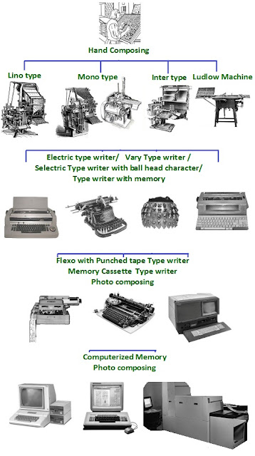
However when Offset printing gained momentum, the Electronic typing whose fonts (letters) resembled to that of hand composed type faces overtook the hand composing and became part of mechanization in Type setting system. Various models of Electric Type writers entered into the market which had several type faces. The type setting (Composing) done with those machines were called Cold composing.
The corrections could be then and there carried out using correction ribbons and the prints – justified matters- taken on the white paper were used as camera ready copy and to do page layouts for further processing for Offset printing. In the Cold composing era came several models and improvements in the form of single element ball like type heads on the electronic typewriters which further speeded up the jobs (see illustration) in addition to cutting down the operational cost considerably.
As the trend grew, there was spurt in the use of Electric type writers for type setting and in further improvement machines called Vary Typewriters entered into the field which can produce over 300 different type faces. Then came Flexo writers. In order to help speed up the corrections on the cold composed matter, punched tapes could be obtained on the Electric type writers in the first typing itself and instead of retyping the whole matter with corrections, the punched tapes could be run to stop at appropriate places to carry out fresh corrections and to carry on the Type setting to make camera ready copy. The typesetters no longer was required to type the documents twice. They were called Flexo writers.
In further development electric type writers with magnetic tapes that can store the typed matter were introduced. The magnetic tape cassettes with the typed matter could be replayed and corrected to produce corrected copies for printing. The fleet of all the Cold Type setters were able to produce justified text with variable horizontal and vertical sizes with ease. It was also possible to store the typed matter in the machine memory, replay to edit them to make correction wherever necessary to produce camera ready copies.
The Offset printing process could be speeded up by getting the corrected versions typed directly on Paper based printing plates, ready to use on the machine skipping the intermediately processes like negative making and plate making to produce metal plates. Thus they were all called Cold Type setters. Much of the small Offset presses used the cold type setting method than the mechanical composing because of the speed and low cost involved.
These developments later led to the introduction of several improvements in the form of Photo composing machines which could relay the typed matter on a monitor that can be edited simultaneously by another group without disturbing the on going type setting process. Once the editing and correction is done, direct negatives from the type set matter can be obtained. The Photo composing machines were inbuilt with film setters and suitable software to carry on this function.
Now the emergence of fast growing desk top publishing is based on these cold type setting technique only.
………..Additions to alphabet T to be continued under T/4



Recent Comments